MathDash

(2025)

Type
Contract
Role
Content Strategist
Project
Defined brand voice and tone. Designed content for AI-powered features, including chat interactions and practice hints.

CONTEXT

AI-powered math learning product for students training for competitions
MathDash is a YC-backed startup redefining math competition training. The platform offers interactive lessons, practice contests, and AI-powered mentorship to help learners sharpen their skills.

CHALLENGE

The content doesn’t lead users naturally, causing confusion and low engagement at first use
Method 1
Positioning statement workshop with stakeholders
Facilitated a workshop with stakeholders using a Geoffrey Moore–style positioning framework.

Method 2
Rapid product messaging testing
Developed four product messaging directions and tested them with real users.

Method 3
Competitive landscpe research
Analyzed competitor products to map the market and uncover opportunities to differentiate MathDash’s content and voice.
Competitive Landscape
While many competitors present a modern and playful approach, MathDash takes a more serious, results-driven tone rooted in its math competition focus.”
Voice Positioning Overlaps
To differentiate from overlapping voices in the market, MathDash emphasizes a competitive, coach-like tone focused on long-term results.

SOLUTTION HIGHLIGHT

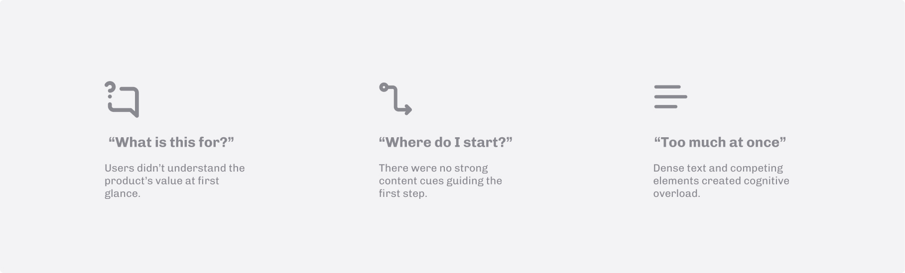
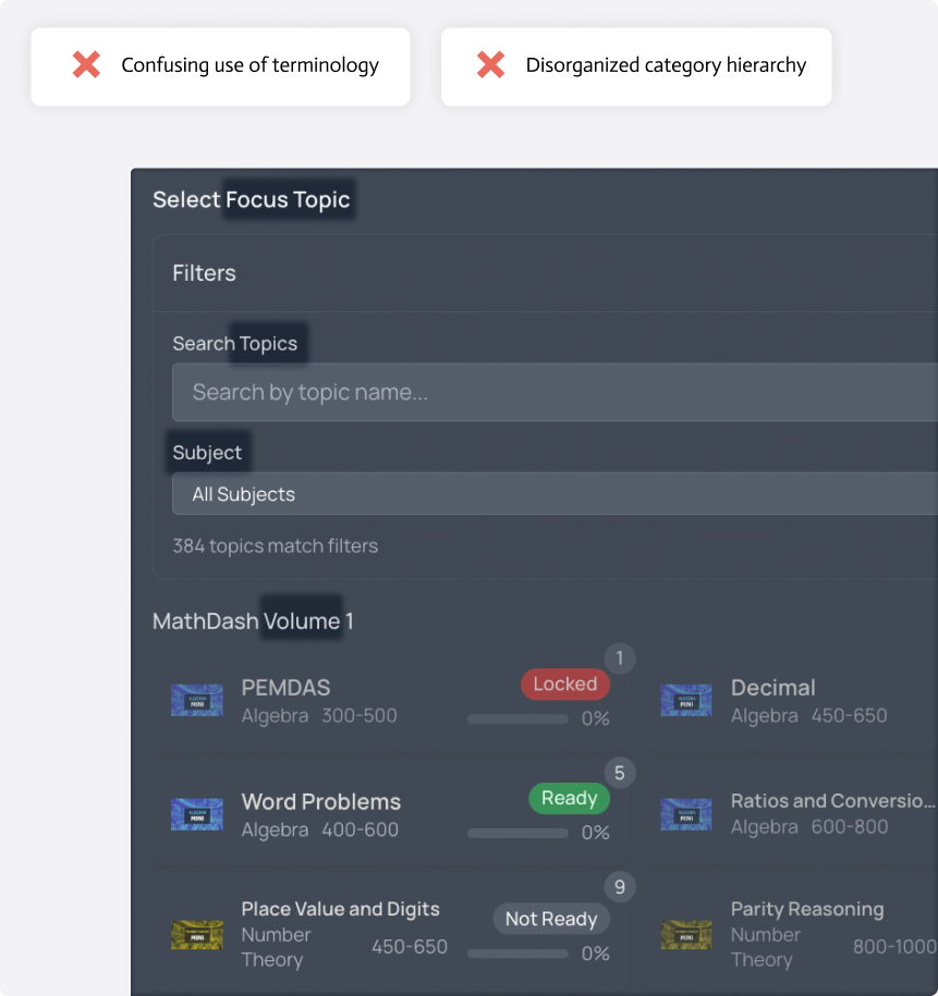
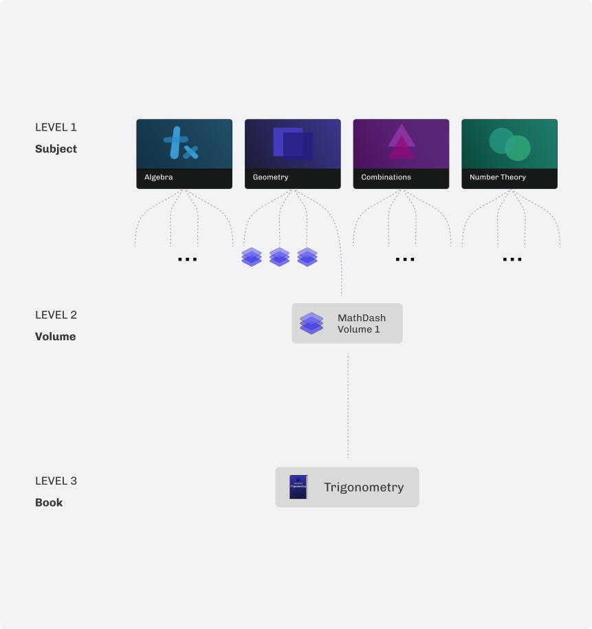
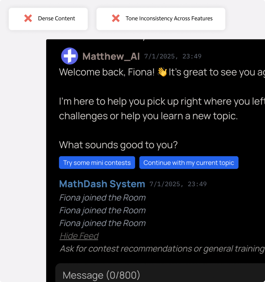
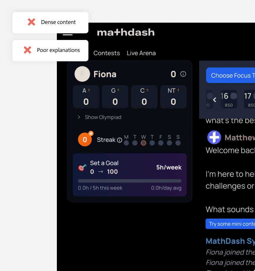
Ambiguous Terminology and Navigation
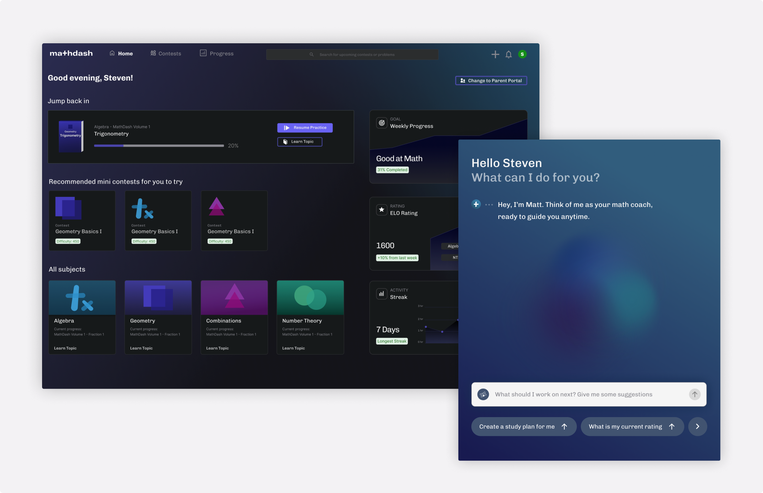
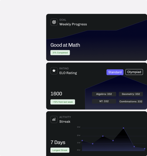
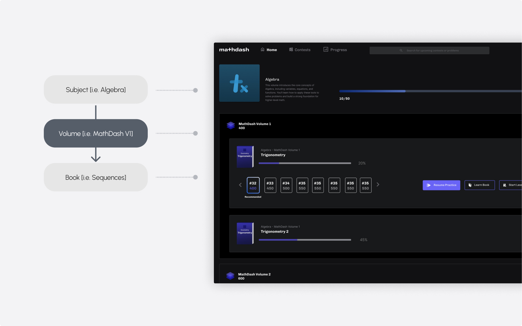
I conducted a thorough content audit and redesigned the key terminology system, which informed the product’s overall organizational structure. The platform faced challenges with ambiguous course-related terminology—categories like subject, topic, focus topic, volume, and course were overlapping and poorly defined.

This ambiguity caused confusion for first-time users and created significant design and navigation issues across the product.
Before
Course-related content had more than five overlapping categories, causing confusion for first-time users and creating organizational challenges across the product.
After
Redesigned the terminology system into a clear three-level structure: Subject → Volume → Book. Users now enter through the subject (e.g., Algebra), making it much easier for first-time users to navigate and understand the content hierarchy.

SOLUTTION HIGHLIGHT

Inconsistent Tone and Voice across AI Features
I developed a voice and tone guideline to ensure consistency across all AI interactions. The platform had multiple AI touchpoints, such as problem-set hints and homepage study plan suggestions, but each communicated differently. The guidelines helped unify the AI’s personality, making interactions feel coherent and user-centered.
Before
AI interactions across the platform were inconsistent in voice, poorly organized, and contained dense, hard-to-scan content.
After
AI interactions now have a clear personality, consistent voice, and concise content that is easy to scan and understand.

SOLUTTION HIGHLIGHT

Progress and Results Are Hidden in Content
I revamped the content design for the Results and Progress cards on the homepage. Through rapid product messaging testing, we learned that users care most about their study results. Previously, this information was hidden, making it difficult for users to track their progress. The redesign surfaces results clearly, providing immediate feedback and improving the user experience.
Before
Progress and results were hidden in content, making it difficult for users to quickly see how they were performing.
After
Redesigned the Results and Progress cards to surface study outcomes clearly, giving users immediate feedback and making it easier to track their learning.

Work with me

I am open to full-time roles in UX design.

Based in Seattle, WA.
Open to Relocation

Hit me up